Sunday, 29 November 2009

Parts of posters- The difference between Theatrical and Teaser.

Although I don't have to do this I thought it would benefit me as when creating, my poster I do not want to get the two mixed up and put in qualities that don't belong into it, hence it is rather brief. Here is one from an earlier film I analysed.


The two are completely different and it is obvious to point out what one is the teaser and which is not. The teaser trailer is mostly dominated by a picture and 4 words, whereas the theatrical poster contains the protagonists, location (in the background) and all the other things that I have analysed to do with posters. However looking at the themes more one poster (teaser) is orientated around the murderer and his/hers weapon where as the theatrical poster is more orientated around the victims. The teaser trailer also does not contain anything except for a slogan. I will have to keep these things in mind when creating my final poster.

Parts of posters- Bottom parts.


Some posters but not all may contain the lengthy bottom parts shown below.
This is the most traditional format used simply horizontal at the bottom when zooming in more clearly it says the actors directors, release dates, institution logos and many more.


This one that I found had it positioned diagonally i a grey colour with the release date in bold black letters. I like the way this one worked as the light grey blends in with the white and the slogan, and although its there and takes up a large amount of space, it doesn't take up all of my view.


Again unlike others this had been positioned vertically and again is coloured in a light grey/white colour. Many film posters often have to have this piece of text at the bottom as a legal requirement even teaser trailer. Hence they do not want it big and chunky and so use light texts to make it less obvious.


From doing this I can now see how this operates and the font that has been used which is long people names such as the directors and actors are usually in capitals. And how the logos are silhouetted etc. Now when coming to mine i will know what to write.

Parts of posters- Release dates.


These are again all pictures from the Internet the first one is from twilight-new moon which uses the American date format, i decided to post it on here as i thought it would be useful for me to know. 3 of the above have mini catch-phrases that are mostly questions, often colloquial and rhetorical a efficient selling point ,for example by looking at 'WHERE WILL YOU BE' this is like saying you will watch the film like its the next big thing. Normally as with most of the examples above the release date is made more prominent than the mini slogan. 'BRING IT' again is colloquial but funny which again will make people want to see the film. Some may use controversial dates such as the Omen, this may scare viewers but also add some atmosphere and effect.

In my poster I have decided to have a mini slogan so this research was vital for me in regards to understanding the codes and conventions used to fulfil this.

Parts of posters- Slogans.

Here are some pictures that I have gathered from the Internet:


These pictures were taking from a range of genres of films and all use the same things. The font is usually plain, nothing to much as it shouldn't be the first thing the viewer looks at. Usually most of these are colloquially written as it is as though they are speaking to the reader/viewer. Many may use traditional sayings or quotes and then add a twist to it like 'HERE COMES THE BRIBE" in order to gain attention. Or simply some may just have a relatively quick sentence of two about the film and what it is about etc.. By doing this research i can see the methods used in creating a professional, 'suspensing' slogan which i can use for my film and i can see the font, background and effects institutions have used and they can relate to the audience.


Parts of posters- Actors names.

I have realised after looking at quite a lot posters the actors names normally appear at the top and normally are blended in with the colour scheme.


In some cases the entire name is changed colour like this one.


Or only their surname may have changed colour as this is what they are most notable by.
This is the most popular technique that I have seen so far.


Although this image has been partly cut of is says "JULIA ROBERTS IS ERIN BROCKOVICH' this is another method that I have come across, when the characters name appears next to that of the actors. However this mostly happens in dramas and films acting out someone's life like a biography.

Parts of posters- Titles

Listed below are the important features of posters that needed to be mentioned:

Out of all the features on a poster the Title is usually the one that mostly sticks out, normally by being more bold and bigger or just simply in another font. Also the title to me is the main thing that sets the colour scheme, as it can
be one of the first things to look at. The examples that I have decided to use are from various posters that I have found of the Internet.
All of these titles have eye-catching techniques used in them. In Ocean's 13 the number has a different colour to the red adding more of an impact, in Sorority Row it has been underlined in what can be interpreted as blood and instead of a normal 'O' a letter has of the Greek alphabet has been used to convey the theme of Greek collegiate life, the Proposal has been highlighted by using a different font and colour this emphasises the idea of marriage etc. Again coming back to the idea of symbols/unique fonts used within the titles is a really good idea of portraying certain concepts of ideas other examples of this that I have found are shown below:

The '£' sign maybe something that is a theme in the film or it could be that something in the film has something to do with money. Something worth mentioning on this is that the '£' sign seems to be emitting more light than the other letters showing that this is important.


This film seems to be about numbers and maths, obviously. And this is reinforced by the '3' acting as an 'e'.


The idea that it's a musical is shown by the font that has been chosen. The light bulbs in the letters are normally those around actors/actresses mirror in there dressing room, hinting that this is a theatrical film with singing.


Poster 5.


Twilight:

- Romantic fantasy film released in November 2009. It set the records as the biggest midnight opening in box office history, achieving $26.3 million. A midnight market technique used as this film as about vampires who as we know mostly come out a night.

The most prominent feature of this poster is the 3 characters in the middle, two males and one female. Each male is looking away from each other, hinting that they are against each other/in conflict this can also be seen in another way i.e. their backs are to each-other and they are not looking at one another.

The female, with her arm around one of the characters although this appears to not to be a romantic gesture, but instead it appears as though he is protecting her as he is more muscular and built than the other. This is emphasised with the males strong bold face. The pale male figure is looking back at the girl, as if she means something to him conveying parts of the story-line.

The female figure looks torn between the two male characters and as she is the only female she is singled out in this image, and looks more innocent, signalling that she may be a protagonist.

The background is in the forest with a crescent moon in the sky. This effect is called ambient lighting as it is the only light emitted from the scene and 'rays' down onto the characters. The area that the film is set in from this poster looks highly rural with large forests areas with tall trees that seem barley inhabited unlike a suburban areas or cities.

The mist towards the bottom of the characters feet, add a mysterious streak to it as the entire figures are not visible. Other pieces of mis-en-scene that are important are the clothes that they are wearing, which look like typical teenager clothes i.e. Jeans and t-shirts. This helps appear to it's intended audience.

The font also adds to the theme of the poster, it makes it appear more magical with the 'twilight' at the top makes it easy to see that this film belongs to a series. But by using the word 'saga' defined as a long, involved story, account, or series of incidents/heroic achievement. This word created more impact as it illustrates the story to be ongoing, hinting that some characters may have prolonged life etc. The 'New Moon' is the most distinguished piece of text on the page (as it is highlighted and 'bolded') as it relates to the story, and the moon in the background.The actual title New Moon makes it seem like things are different in this movie in comparison to the others.

Then below it a divider is used an another crescent moon has been inserted all these little things have an input to the overall impact/atmosphere it creates on the viewer. Things appear more fantasy based.

Another thing worth mentioning is the way that all the text is joined up together, using an example from the poster, posted below


By having the text all joining together makes a sense that everything is connected and that things are put in order for example new moon is in the series hence it is situated below. Every bit of text is entwined with each-other.


The release date is then posted at the bottom of the poster, all in digits. Although i haven't seen it before, or i haven't picked up that the month of the release date is positioned first and then the date and year. After looking at this for a while i have realised that this is an American film and most American institutions use that format. Below the release date again like other posters is the logo of the institution that is behind the film, blending in with the colour scheme, not taking up to much of the focus, but can still be seen.

Overall when deconstructing this poster I have come to see that there has been a lot of thought and effort gone into this, and that many ideas have come out when looking at it and, that little things such as the moon placed within the trees can have such a big impact on the viewer. I will have to keep this in mind when creating mine if i want it to look professional and resemble professional ones like this.

Poster 4.

THE ORPHAN:

-An American 2009 horror film, about a couple who decided to adopt a child, but is doesn't all go to plan as she hoped. It received mixed views.

The main part of the poster is the characters face, which even though is that of a child's, does not look innocent but looks old. The shadowing on her face for example under he eyes and around her jaws create a sinister feeling. Her eyes are black and cold with no pupil as it seems. Her hair is traditionally arranged in pick tails with ribbons which is rather old fashioned as well as her clothing which makes you wonder why she is so young yet wearing 1930's clothing, appearing emotionless. The character does not look happy her lips are pursed and her gaunt eyes look like they are staring directly at the viewer, creating an uncomfortable atmosphere.
The background is just a simple white, but even that has black/shadow areas. Although you can identify the characters features, something doesn't seem quite right, she doesn't look like a child should, happy. Plus the mid close up shot that has been used, makes this picture look as if it is a mug-shot. The word "ORPHAN" is the main piece of text in the lower half of the page and its style looks child like, like it has been scribbled down. The catch phrase the most important part of text in the upper region of the poster "THERE'S SOMETHING WRONG WITH ESTHER" again highlights the fact that something is not normal, a feature used within many poster in the horror genre. The last piece of text is next to the screening/release date "can you keep a secret" this is colloquial message making it sound personal to the viewer by adding "you" although it is rhetorical as it does NOT need to be answered.
Also when thinking about an OPRHAN alone, you have a preconceived idea, that although they have experienced sad things in life, they are innocent and smiley... cute unlike the one of this poster which goes against that ideology. Unlike some posters the institutions logos have been placed in each corner in simple black and white, as therefore they do not draw away much attention, but may have to be there for legal reasons.

Poster 3.

THE SECRET WINDOW:

- This film is the oldest I have analysed out of the posters so far released in 2004, categorised under the same genre as mine, psychological thriller. It received mixed reviews. However unlike mine it focuses on mental illnesses.

From starting at the top of the poster and working the way down the first thing i see is the actors name in the same colour and font as the main title, oddly this one has been spaced out more so that it is easy to see and comprehend. Under the actors name the title is positioned "secret window" The secret is just in the normal font however 'window' has been emphasised by increasing the size and boldness. This can be used as a metaphor as the film focuses on mental issues and window is something that is looked in our out of this one is 'secret' meaning that this type of view/window has never been looked from upon in this way, and that it is not just any ordinary 'window'. The image that takes up most of the poster is what I assume is the protagonists face. In which he is wearing glasses, which seem to be rigid and old fashioned and un-groomed, with facial hair growing and long hair. His eyes are pointing in another direction, not at the viewer...maybe he is on the look out? Looking for someone in the corner of the poster there is a small cottage surrounded by trees. It seems that the film is set in a rural areas, where nothing like this happens and the background onto this picture gently fades into the the protagonists face. An effect which has been done by various editing software such as photo shop. The viewer is not able to see much from the picture at the sides as most is silhouetted. The last aspect of the poster that needs mentioning is the 'slogan to the film' 'SOME WINDOWS SHOULD NEVER BE OPENED' obviously this doesn't mean normal windows, again its a metaphor that has another meaning, and with the word 'secret' in the title it creates an un-nervy feeling, like i want to find out, but i don't. I decided to analyse this poster as i liked the atmosphere it created and hope to have this for mine and because of the slogan and where its positioned and how it's used.

Poster 2.

TAKEN (2008):

- After watching this film for media on sky movies, I decided that I would analyse it. Although the film may not have had the best rankings and reviews, I thought that the film was excellent and some of the techniques used in this film, I looked at and put some of my own ideas in and incorporated them into my own.

-The most obvious and important feature on the page is the male character. He is dressed in a black suit and a white shirt although the white shirt isn't white it's like a grubby white, indicating that this suit has been worn more than once. His face and hair looked un-groomed and un-washed, like he has given up about his appearance, he looks tired and ill. With the gun in his hand, he looks ruthless... capable of anything and the suit only emphasises that he could be a professional in this 'game'. Interestingly his eyes are positioned towards the sides, like he is looking for something or someone and his is on the alert, this can be important as when looking at his hands one is wrapped around the gun ready to shoot. Interestingly the background colour contrasts with that of his suit. Everything in this poster looks cold and emotionless. The background is a scratched wall which can be interpreted as someone struggling at an event that has taken place. The 'Taken' font is a light gray colour and is oddly positioned at the edge of the page vertically within the font a young girls face is visible, she looks innocent and happy, although you can tell just from looking at the picture overall, this is not the feelings that are in the film. It appears as though he is looking for her. The only other piece of text is the actors name which has been positioned above the title in the same font and colour.

This poster is probably the most minimalistic I've ever seen yet it's effects are momentous. In this pictures it looks like all happiness has been wiped out, everything looks miserable, dark and tiring. The male character even looks tired and on the verge of giving up. Also he has let his appearance go a bit, not really caring about what he looks like. Although there is not much to say about this poster on a final note it is really good at portraying the mood and theme of the film.

Poster 1.


Jennifer's Body:
- Is a 2009 black comedy and horror film directed by Diablo Cody and includes many famous stars including Megan Fox who is the protagonist. This film was highly successful in box office and achieved a majority of positive reviews.

- I have decided to analyse this poster as it is one that roughly relates to my genre and its new in the mainstream media film industry being released in November.

This poster as it appears is dominated with the idea of femininity, illustrated by the red lips and blood seeping down. Plus with the tongue positioned towards the side of the mouth as though the character is licking the blood in a seductive way, hints at the idea that sex and seduction as another themes within the film. After looking at it for a few minutes the red lips made me wonder if it is lipstick/lip-gloss, or is the makeup she is wearing made from the blood? Whether or not this is true, the dark rich red really highlights and make this feature the most prominent on the page. When looking at the image more closely, the viewer is able to see the shininess of the lips, teeth and blood which again makes things appear more glamorous and sophisticated, because if this picture of a man doing this was on the poster it clearly wouldn't look as elegant.

-The paleness of the skin is another factor that should be mentioned, by having such white and cold skin it really makes the lips and blood more bolder. However the skin doesn't look just pale, it looks sickly pale or deathly pale this has been emphasised with the dark areas around the lower lip and nose. By using a lower face shot where the viewer is only able to see the lower half of the face really makes the 'onlooker' curious. As the eyes are an important characteristic on the face which make people relate to other people. By not having them on view is mysterious, it could hint at the fact that this character is not actually human, but just looks like one, an anthropomorphic 'thing'. As the features of this character simply look too good to be true, gleaming white teeth, perfect lips and it is obviously that she is young mostly likely late teen years, why no spots?, clear skin, perfectly conditioned hair.... things just seem to good and the blood that has been used shows that something is not quite right.

The text is kept to a minimal on the page as the picture takes up most of it. The text is interestingly the same colour as the lips/blood which makes the viewer create a link between the two. After being drawn in by the lips I immediately look at the text after. The first piece of text i am drawn to is the most obvious one, the title of the film "JENNIFER'S BODY' Jennifer in itself is rather an innocent name, that of a child's and by using the word body, gives a message that death is involved and things again become more innocent. It make me question whether the blood on her lips has come from Jennifer, is she the protagonist or the antagonist?
The actress that stars in this film is then positioned above the title 'Megan Fox' a note-able actress that has also appeared in many other films including that of Transformers. By displaying the actresses name on the poster, entices her fans to come and watch the film as well. Other pieces of text displayed on the page include previous films, that the directors/producers have made .'JUNO' a highly successful and sarcastic film, hence many traits that appeared in 'Juno' can be expected to be used in this film and, the coming soon, indicating that this film will be up for viewing again enticing potential viewers/customers. Finally another aspect that I have just realised about the title in the poster is the font and how it is bolded and outlined in black. After research i have found out that this font is usually used within schools in america, for boys football/sports teams on the back which portrays the location for this film in a way. Proof of this is a picture below.


Overall this poster uses the different codes and conventions to draw in customers and make people want to see the film and want to know what it is about and why the blood is there? After seeing this poster I know that i certainly would want to go and see it. From analysing this poster I can now see the techniques used within the black comedy and horror genre to draw in an audience, make the poster look professional etc.

Further poster research

After finishing my trailer which shall be uploaded with a full evaluation in my next media lesson, I have decided that I will complete the theatrical poster task.
To accompany my task I have done more poster research to give me a better understanding, although I have already analysed three posters, I will be analysing others more in depth highlighting and evaluating the minor things. I will be analysing not only posters within my genre but also other ones, so i can see different techniques that are used to create different effects and how it works to relate to their target audience another aspect i have used to do this is not only analysing new posters but looking at old and more original ones to see the development of ideas within certain genres. Also attached to this post I will have sketches/layouts of my ideas etc.


Monday, 23 November 2009

The Music in my film:

I thought that it would be appropriate to have a range of sound effects and music within my teaser trailer, as I have realised that this is what the professional ones, that are currently on the market have due to the teaser trailer being composed of different parts footage to show a vague idea of what it's like.

Music and The Creation.
When opening Garage Band, I thought it would be important and necessary to familarise myself with the instruments, tempos and selections. Proof of this is the pictures posted below.

I decided from the start that as the beginning of the teaser trailer would reflect upon the antagonists up bringing and home life and I wanted to really emphasis this, as i wanted the audience to kind of in a way have pitty for him but not feel sorry for him. Hence I thought that this could be portrayed by a classical instrument such as the piano. I browsed through the songs and picked the more delicate and emotional songs as these created the most empathy.(the piano songs are in green) Then after establishing that this would be my the first song in my trailer at the start, I thought of the idea of this continuing throughout the flashbacks, it would then fade out and that is when other sound effects and music would be added. Plus this piano 'song' is the only piece of music I really have, the others are just sound effects. By using such a technique it would really capture and highlight the important parts of the trailer, the underpinning for my story.
After making sure the piano sound track was sorted I then moved onto, other sound effects that would be needed to create suspense and scare my viewers. After browsing through the categories that are shown on the picture on the left i decided that it would be more efficient and easier to use sound effects from the I-movie program itself then I would save myself the trouble of having to convert the music into i-tunes format and then uploading it into I-movie. As i do not have the program and my coursework on my computer, that I am typing this post from, I will be sure to screen snap some of the sounds that I have used.


This screen snap positioned on the left shows the advanced level of garage band that I was using and how I used it to make my sound tracks sound more professional and higher quality. The picture above is where i used the volume controls to use make my piano song fade in at the beginning as this is when the green approval screen is on, and then fade out when the important parts of the trailer begin (the present time i.e. after the flashbacks) Although when using this tool I had to be careful not to 'disturb' the equilibrium of the sounds etc.

Friday, 13 November 2009

Latest progress (teaser trailer)


This is my latest progress so far, although this is not finished yet so there are some gaps.

After the green and logo screens, the viewer is then presented with the first of 3 flashbacks, this flashbacks are differentiated from the rest as a black and white effect has been added, although i have considered most of the film to be black in white, but im not sure yet.
This is just a rough copy i have yet to apply other editing techniques.


Wednesday, 11 November 2009

Todays Editing.

In terms of the editing that I have done today, i have edited some of my footage cropping it down so I can save time within my film, i have been experimenting with photoshop as the fonts and styles on I movie in my opinion do not give the high standard professional look that I want.
I have created my production name in photoshop (TRT PRODUCTIONS) which will be one of the distributors in my film, simply a black background with white font, currently i am trying to create the registered trademark sign, as then my 'logo' can resemble professional ones on the market. Most of my title slides are complete and will be entered at the end of the film, when all the footage has been cropped and edited.
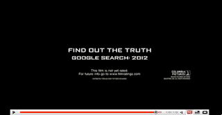
Now after spending some time on I movie, i will move to photoshop and create me last slide "coming soon" which will feature other logos and the list of directors and producers at the bottom, like the picture posted below, plus whilst doing this i quickly went on youtube so see other styles used within teaser trailers, my findings posted below. I will update further progress as soon as possible.


Tuesday, 10 November 2009

First upload of film.

I have made further progress in relation to the date this was posted, but i haven't been able to publish this yet.
This was my first time at editing the film and above contains the first three shots:

Green screen: This gives the teaser trailer a more professional edge I simply screen snapped the image and then using the crop tool was able to shorten it's size to fit the screen measurement of my trailer. It technically shows that my film has been approved by the Motion Picture Association of America, most teaser trailers and theatrical trailers contain this, although as i stated in earlier posts my film is a British horror as i found from my research that most mainstream commercialized horror/psychological thriller films were American, and by having a British one could "fill" the gap in the market. Plus most major film distributors and film orientated companies are usually based within the USA.

Paramount: I noticed that in many teaser trailers there is normally two distributors who have become associated with each other for the making of my film, for example it normally presents the big corporate, international, conglomerate companies first such as Dreamworks, New Line, i decided to have Paramount, but as this is a teaser trailer, like most the shot will last for only a few seconds and it will be the end part of the logos animation. Then after the main distributor has been shown there is normally another smaller more independent one. I decided to create my own one which will show later in the trailer called TRT PRODUCTIONS.

Establishing/ Panning shot: Like most teaser trailer there are often establishing shots at the start, as i have found out from my research, for example in sorority row trailer, the first 3 shots are of university and sorority life and the characters social activities. By having this shot at the beginning i can easily portray and get across to the audience the majority of my mis en scene, this being open areas with forests and ditches etc. I decided that I would make this black and white as I really want to highlight the full moon. Although i may change this shot to the other one i filmed, my reasons stated in an earlier post.


Although overall there is a lot more work to be done such as the following from scene to scene, after solving this problem i will then update my progress etc on a later blog.

Monday, 9 November 2009

Notice.

Unfortunately after filming my original footage and uploading it onto the computers, I realised that the lighting conditions were to dark and didn't not fit in with the other mis en scene of my film, and so therefore I had to re film the antagonists walk, graveyard and the cover observation scene. By doing this i can ensure that I have included he most highest quality shots within my trailer.

This time, like the others I started to become more confident with the camera, going for different and unique angles, which will later be posted after uploading them onto the blog tomorrow.

Friday, 6 November 2009

Progression so far: Titles,

After looking back at my research I have realised that teaser trailers often contain large amounts of title transition slides, usually on a black background in order to get the basic ideas/story-line of the film across. Below are some of the shots I have found from the trailers I have analysed, and otherwise would not have noticed.

Some of the slides may make reference to the directors and producers of the film and the awards they have won. The reason for doing this being is to show that the producers, must be of a very high level and must have created very successful films to have won awards like they did. Also by having this the audience may remember the producers from the other films etc.

I have decided to have this in my trailer, and am still in the process of creating a slide like this, when finished I shall upload the image.


This is another slide that I have come across and like I said above makes references to famous and prestigious film festivals such as New York film festival, to make a link with these in a teaser trailer can also give of a good impression, as to be associated with these festivals is obviously a big thing, and when viewers see this they are more likely to think that they must be good films, to be included in these events, enticing the general public to go and see it even more.

I have found out after doing little bits of research around this topic that the teaser trailer is often realised to such institutions first before putting it on display to the public, as then opinions of the story-line and footage can be commented on.
Today in lesson I thought it would be good to have a go and make my own one, so I could see if it looked good in my film. It was simple and basic but in my opinion did look good. When creating it, it took the form of a comment made by a editor of a magazine. When doing my final one of these I shall use the magazine that I will be later creating.

I decided after looking at the two slides above i would make a link with an award or something that the audience can relate to, so I decided to go with the Oscar idea. I used my friends name and a magazine that just came to her head, as this is only a draft. When going back to school on Monday I will be creating all of my transition slides and each will be posted on the blog, as I have now got the use of Adobe Photoshop. Overall I think by having plain colours like this makes it really bold, and fits in with the colour scheme that I am working with in my teaser trailer.


Monday, 2 November 2009

Covert Observation within my Teaser Trailer.

In my teaser trailer i have found out that I will have a technique used in it called covert observation.
Covert Observation in itself is when a person does not know that they are being watched this often happens when a murderer is stalking his victim. I have decided to have this in scenes for example when the protagonist is running through the forest and there will be mutliple shots of her from as many different camera angles, before she is attacked, although she may believe she is getting watched, when she looks over her shoulder she just thinks it's a funny feeling hence this is still covert observation.

I like the way i have incorporated this into my storyboard as then I can get really effective shots for example looking out from a bush, or looking over some branches etc as I think it creates a really suspensing affect.

Software that I will be using.


I movie: I shall be using this to edit my footage that I have taken adding effects to make it look more professional and to get it more to fit with the codes and conventions of a teaser trailer. After editing all my movie I will upload a full and detailed blog on exactly what I done and why.
I have I movie at home, so through the half term I practiced in creating short still story boards to get used to how it works, so that I wouldn't be stuck when editing the real thing.


Garage Band: I will be attempting to create my own track which shall be played in some parts of my trailer, by using this i will be able to create my own original soundtrack, which will avoid copyright issues.


Photo shop: I will be using this software mainly to edit all my images and add certain effects to them, by doing this I can make things look more professional and will be able to delete any minor errors. Plus this editing programme will mainly be used for my magazine and theatrical poster.


Filming!!!

After finalising my story board, in which I needed to cut out some of the shots that I originally intended to have but unfortunately didn't fit in with the ideologies of my teaser trailer.

I set out filming when it started to get dark as I have realised that most horror/thriller trailers and movies have the majority of the film in dark light conditions as that is when most negative things happen. I emphasised this in my film by having a close up shot of the misty full moon which I thought would add suspense.

This was my second time at filming/using the camera I stated to feel much more confident and so far have filmed the majority or my teaser trailer, and have created an I Movies project, where I have created an opening sequence to my teaser trailer (green approval screen, paramount, T.R.T productions etc)

I will be filming two more times one early in the morning, as this is when most ambient lighting is available and things are more quiet without distrations and random noises, and another night scene which will take place in the graveyard.

STORYBOARD (ANIMATIC)