My evaluation has been filmed today finally. Now that I have done this i can assure myself that I am using a range of new media technologies in my coursework.
Unfortunately due to technical issues I wasn't able to show my hyper links I tried before the test but they wasn't working. I thought I would place this post as I can still prove that I have used hyperlinks. The touch screen wasn't letting me scroll and sometimes it would be hard to close them, which is why I thought it would be more easier to leave them out.
Monday, 25 January 2010
My products in accordance to MIGRAIN.
M- I used a range of media including magazine, posters and teaser trailers each of these have their own codes and conventions e.g camera angles, colour schemes, institutions etc.
I- The ideologies behind my products conformed to that of the psychological thriller genre. Heart beat lines and red hand prints were used in order to create suspense and build up tension. Additionally another common convention used within this genre is the idea of black backgrounds, as most negative things tend to happen in the dark e.g. murders and GBH.
I- The ideologies behind my products conformed to that of the psychological thriller genre. Heart beat lines and red hand prints were used in order to create suspense and build up tension. Additionally another common convention used within this genre is the idea of black backgrounds, as most negative things tend to happen in the dark e.g. murders and GBH.
G- The genre of all three of my products was psychological thriller. A sub genre of the thriller genre. I looked at professional products within this genre and Incorporated these into my own these including, sinister and freaky slogans. Like most psychological thrillers i've focused on the plot of what my antagonist going to do instead of the main characters unlike other genres.
R- Representation, through a range of techniques used including camera angles colour schemes, pictures, visual affects, audio affects etc.
Audience- Six Form students aged 16-18.
I- I choose to select paramount as my institution for my film, as it is paramount that has had a large number of successful films within this genre. This can be seen on my blog. In regards to the instituion for my magazine I would most likley use Bauer as I did with my AS coursework.
N- Narrative again the codes and conventions that i used. Colour scheme. And how I got my ideologies across nice yet disturbing images etc.
Saturday, 23 January 2010
Progress so far.
In regards to what has been completed, I have done and finished my trailer, which shall be uploaded Monday as is it currently on Media Data, my magazine and poster.
What's left:
Currently I'm just finishing of my evaluation, in which i have addressed all the questions set and mentioned more. Within my evaluation I have used different media techniques and it is not just a usual powerpoint, it shall have hyper-links, films etc imbedded, images and many more.
In relation to how I will voice my evaluation, I will either do one of the two options;
a) Present the evaluation in front of a camera with an projector.
b) Have the slide show with relevant voiceovers.
As the deadline is Monday, I will be doing option B anyway in case their is a shortage of rooms & cameras etc.
Stages of Magazine
These are the stages of my magazine, more in depth ones will be included within the Evaluation.
 Free commodities, plus I noticed from my consumer/ marketing research that most people within my intended target audience are going on holidays with peers.
 Again, other free commodities, this would also make people go to see the film, as it is potentially free. Win has been highlighted and emphasised with an exclamation mark.
 Execulsive- only with the magazine etc.
 The development of my magazine. My magazine, was done on photoshop, this was tricky at first, but I really liked the way it layered each different aspect of the cover, this was really helpful when wanting to edit individual things on my magazine.
 This was the basis of my magazine with out hardly any cover issues and other titles, I could use this as a foundation to build upon from.
Tuesday, 19 January 2010
Final version of poster
Monday, 18 January 2010
Magazine photos.


 One of these shall be my magazine cover image, I decided to take it in a forest as most of my teaser trailer mis en scene is 'forestesty'. I thought I would have a model look/effect going on going on this could easily be created with a designer jumper (interestingly a British make, i was attempting to make my film as British as possible as most are usually American these days) and combats. I really liked the photos that I took, and am glad my brother could do the poses he done in order to create a professional affect, hence mine can resemble professional magazines. Also all of these are long shots, which is what most magazines tend to use.
 In relation to my idea of what I shall do with these pictures I was thinking I could either:
* Have the forest in black and white and the character in colour to make him more significant and prominent.
* Or possibly the other way around making the character seem out of place and non-related to the backdrop.
Although I think that the first choice is most likely what I will go with.
Pictures continued.


Poster:
These are a selection of photos in which 4 will be entered into my poster, obviously before they are entered they will be rotated and changed into black and white. They are all of children as I feel and is proven from my research are more innocent and pure, like they would harm no one, which defeats the object of my film.
 This is what the image has looked like slipped, it has been moved lower down and rotated. All that I have to do is reflect and shade it to make things appear more soft and suttle yet sharp, eye catching and questionable.
This is a almost completed version of my poster, all that I have to do is add the remaining photos in which again will be turned into black and white, via the effects on photoshop, I then shape them into the squares to make it look genuine.
In regards to audience feed back thought the production of the poster, I constantly asked for a range of people opinions peers, friends, other students, fellow teachers and family. This helped me alot as i was given feedback as to what photos to use, the extent of shading and reflections and many more aspects.
Overall I am please with the progress so far, and it will only take me an hour or so to complete. I think that it creates a really disturbing atmosphere which is what I was initially going for and the way it makes things appear ok on the outside but quite troubling on the inside. Plus the style adds to the ornate, overall effect and convention.


 These are the first lot of original images I took. They were taken from a photo album were mu family went to Disney land Paris. I thought that these would be excellent photo's to use as they really convey the meaning of family and family bonding etc. In which my film the bondage has been broken, that was once existing. One photo on my poster will have slipped from the album meaning that something is not quite right, one family member is isolated and something rather strange this will be reflected and shaded so it will create a more sleek affect.
The aspect that I am trying to represent, is that everything was 'ok ' at one point, all the family got along, happy days! every thing is relaxed and free etc. And now they one photo (the photo that will be slipped out is pic 2, as you cannot clearly see his face and he looks rather angry etc) meaning that something weird and unusual has occurred.

Here is an example of what i did.
I decided to have it in black and white as i felt things where more dramatic and scenes from when the protagonist is little have appeared in black and white flashbacks as well, also because the only coloured things in my poster is 'Victim', the slogans and the heartbeat and i really want these to be prominent.
Proof of footage & Final Stages.
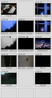
 These are the clips that I imported from the video camera I hired, when a clip wasn't used instead of deleting it, i would place it back on here. On Monday if possible I will try to upload the raw footage as I have learnt to transfer I movie into Quicktime, however this maybe lengthy.
All in all my trailer was finished on Thursday, however I went over everything on Friday ensuring that everything is up to scratch. I checked stuff like:
Voice overs were clear.
Sound levels.
Transitions.
Quality of clips.
Fluency.
Codes and Conventions used.
And if it looked professional or not.
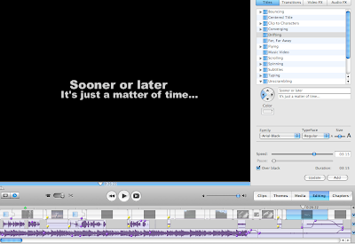
Here is some proof/ evidence that I can say what I did.
Origional Images (Poster)


 These are the photos of the family album I obtained. I liked the archaic and traditional aspect of this, the script also creates a very elegant and sophiscated effect. I noticed that I took pictures I could mould them into he 4 slots, although 4 isn't enough so i thought its better to use the double page family album in order to have 8 pictures, so more pictures can be placed, adding more impact.
Progress so far:
As most of my work has not been posted on thee blog yet I will update you in regards to what I have done:
* Started my magazine, due to all progress and stages being saved on my school computer they shall be uploaded tommorow.
* Taken 1 extra scene for my film that will also be inserted tommorow.
*Taken my magazine pictures, which take place in a forest, as this is the main mis en scene of my film.
* Evaluation I have started typing out what I shall say and present.
*Progress of poster.
Subscribe to:
Comments (Atom)

