Friday 30 October 2009

Props and locations.

Most of the filming will be done around Epping and Theydon Bois where i live, and some at a train station again in Theydon Bois. More in-depth details will be given in my animatic story board, which will be posted soon.
The basic prop list: (in random order.)
* Dark cape
* black gloves
* knife
* shovel
* phone (mobile)
* hood
* door handle
* bag
* hood
* torch
* frosted window
* spotlight

Filming.

Throughout the half term i have been experimenting with the camera, due to me feeling at first unconfident. I have basically been taking the different shots that will be in my teaser trailer such as establishing, panning, extreme close up etc. (This will be added to the blog on monday). I did this to make me feel more confident with filming and hopefully improve my ability using it.

I have also been filming the actual footage of my trailer, this will also be uploaded onto the blog as i can then see how i have improved from my practice and to see how i have come along after all the editing has took place!


Sunday 25 October 2009

Construction: Ideology within teaser trailers, posters etc.
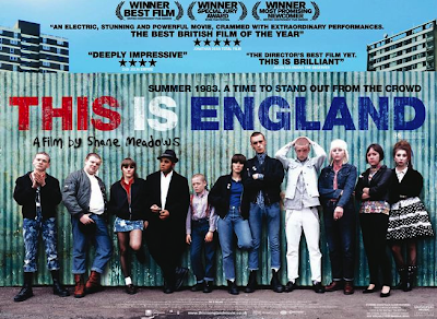
In general ideology is defined as a system of belief that is constructed and presented my a media medium. Although after analysing some media texts i have found out that a media text can often have more than one ideology, for example when i analysed and evaluated the sorority row trailer i found out that the dominant ideology was the whole idea of the murderer and "the chase" and how the hunt is on and each of the protagonists get murdered, there was a submissive ideology this being, academic and educational background, as the whole film was centered around a sorority which is a social club used within American undergraduate collegiate education.
After research i have found out that dominant ideologies, that has been in the trailers and posters etc that i have been deconstructing are often labelled hegemonic.

The point of conducting this research is so that i can see the way the ideologies are being portrayed through the mediums which i shall be creating, from this i can then include the methods used into my own pieces.
below are some examples.
This is England -
the dominant ideologies of this film would be the idea of patriotism.

As it is all about England.


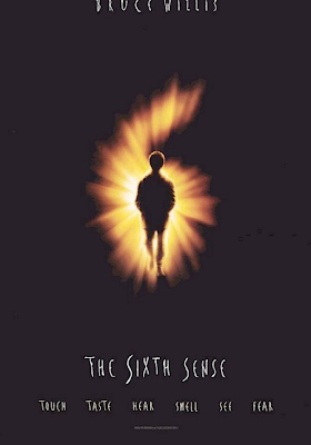
6th sense-
the main ideology behind this would be the concept of paranormal activity.


Thursday 22 October 2009

Narration and Voice overs.

Narration and voiceovers are often vital features used within teaser trailers. In different genres voice overs are used differently examples are posted below.


The Michael Jackson film soon being released in cinemas for a limited amount of time. After watching it back and analysing the voice over they seem to focus on the protagonist, telling the audience about the factual accounts of his accomplishments etc. One think i have noticed in the voice overs that doesn't appear in many other trailers is the voice/interview shots from prominent people involved in the production of the film, where they talk about the choreography etc. Also voice overs are used from clips from important events such as Obama's election campaign etc.


* Upbeat song, keeps the viewer interested shows genre.
* Narrator giving a summary.
* Important parts of the story line is showed through the characters.


* Starts of with conversation...by having this it makes the viewer want to know what the characters look like, what /who they are talking about.
* No voice over.
* Song shows characters feelings.
* By not having a voice over this film trailer is not disadvantaged as other conventions are used that work.

A trailer relating to my genre;

* The opening voice overs have a really dramatic and suspending effect when certainly left me in shock ,when i played it back to hear what they were saying such us "he doesn't want us to cut through our chains" or " he wants us to cut through his feet" etc by having these quotes the viewer then starts to think what is actually happening? whose put them in chains? why are they in that condition, and why would someone do anything this sick? what are their reasons?.
*Other voice overs include "I want to play a game"- something that a child would say but has been manipulated and twisted to mean something else. When saying this the voice is monotone showing no emotion, like when asking the characters to find the codes etc otherwise they will die etc. The voice over voice says it like it's an everyday thing giving the hint that he shows no remorse and is possibly a psychopath.

By analysing these i can see the way producers use the techniques to make it work and what tones of voice are used, what the voice overs talk about etc.

Wednesday 21 October 2009

More teaser trailer analysis:


Posted above is the teaser trailer for the film "Obsessed", a erotic thriller movie produced in 2009. Unlike most teaser trailer
it features the actor and its character, in interview format telling the viewers about the film, persuading them to buy a ticket to watch it.
They way she speaks gives hints to the storyline and genre of the film, and by having the actor (Ali Larter) narrating aspects of the film to the
audience, makes people want to watch it, not only because of the film, but also the actresses fans etc.

Tuesday 20 October 2009

UK Cinema Market (Research) Introduction

Background Research:

The UK cinema industry is a mature market that has enjoyed strong recent growth from the opening of multiplexes. What strategies can cinema operators employ to maintain growth?UK cinema audiences keep rising, but as the market matures chains are turning to alternative content and loyalty schemes to encourage customers to forsake their home entertainment systems.Cinema admissions in 2002 are expected to be at their highest since 1971, with a full-year projection of 174 million admissions


Marketing Strategies used:

Since the economic downturn, the mainstream media industry on a whole has struggled and now companies within other sectors of the market have started to diversify in to other markets they have not entered before, in order to build customer loyalty as a consumer if more likley to stay with a company if they offer more "freebies" and discounts. One example of this is Orange Wednesdays, now customers with Orange are able to by discounted 2 for 1 cinema tickets just for being with their network, another reason why the cinema is becoming more popular in society. This "deal" is often portrayed by the comic advert staring the wicked witch of the east. Research shows that cinema is becoming more popular in todays age as in the UK there are nearly 19,000 people per screen in comparison to a mere 29,000 in 1995.
plus more amateur films are becoming more popular within the UK cinema market as big budget films can often be watched elsewhere, however on the flip-side referring back to the economic situation at hand, the cinema has become an 'cheap' attraction and with the constant release of comedy and romance films on the markets often cheer viewers up!


After reading through some marketing books i have found out that there are two types of markets, in the overall market:

mass market: which sell ordinary things to very large numbers of people at reasonably cheap prices.

Niche market: Serve specialist consumers.

Market Segmentation.

When producing and creating my teaser trailer i will take into consideration my intended target audience. Often a product is target to a specific sector of the market these are:

-Age- E.g. the film "The Queen" was predominately targeted at a older generation whereas American Pie was targeted at a teenage audience.

-Social Class- The social hierarchy consisting of class A (the professionals) all the way down to class E (the unemployed)

-Location- for example trying to sell a stottie cake outside the Northeast would not maximize potential sales.

-Culture/ Religion- different groups that have their own unique products.

-Gender- Some films are targeted more towards males of females for example Wild Child, is mostly intended for girls.

Sales and promotion:

Like the example i used earlier in my blog often special tactics are used to try and draw potential customers in after researching i have found some examples;

-Buy one get one free offers.

-Discounts

-Competitions and Draws

-Free Gifts

-Product trails.

-Advertising in peek hours in largely populated places such as oxford street station.


After doing more research i will publish the methods of marketing that I attend to use, to sell my product, a more detailed target audience blog will also be published, some parts of this will be included in my evaluation.


Creating my own Institution/logo.
Within my teaser trailer I would like the following in the opening sequence:
A major world wide conglomerate film production/distribution company such as Paramount.
And my own institution that i will be creating, by using adobe photoshop and after effects. I have decided that I will name my own institution


Keeping the title simple just the initials of my name, plus by adding productions gives a sense of what the company is about, although at a later stage i may change it to TRT Corporations or TRT media...as i would like the company to appear like a well known conglomerate main stream media production company which has been successfully established in the market.

After coming up with the name of my production company i decided to test it out using very plain and basic fonts only in black and white just to get a rough idea of how it would look and if the name of the company looked professional.


After doing this I found these to be rather plain and would in my opinion not be good enough to appear in my teaser trailer, but i will contain it within my poster as most professional ones do. I will be creating an animated one in photoshop and after effects to give it a more professional edge! I will start composing my logo on these programmes and once done upload them onto the blog. I have already started watching tutorials on youtube on how to create your own logo as I want mine to be completely my own work, therefore I would have to start it from scratch. I will start by posting the outline of my logo and then gradually show the progression into what it will become.

Location shots part 1: From new Storyboard (randomly ordered)
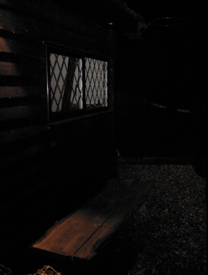
This is the bench in the protagonists garden, which the antagonist will be sitting on, this will flash up within the trailer. I liked the way the ambient lighting within the scene shines onto the bench creating a gloomy dark effect.


The Stalker shot where the antagonist is trying to get closer to the protagonists window in order to see her, there will be multiple shots with this theme each in different camera positions, getting closer to the window, for example the next shot will be up in a tree where twigs and branches are visible to emphases the location!
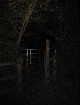
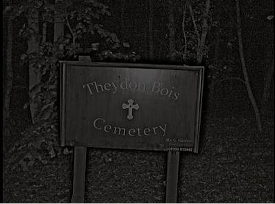


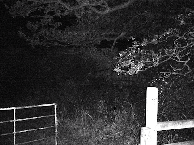
A gate shot: Antagonist walks through the gate in a slow motion..in this shot the trees will be whistling in the wind to create a more spooky atmosphere.

The forests scene is also where the chase will take place.


This is one of the many location shots of my film. This shot will also be incorporated in my theatrical poster.\
The shot below, is the bake gate in which the antagonist climbs the tree in order to get a closer shot of his victim. The gate is rusty adding a creaking effect and the crunching of the leaves and twigs on the ground add suspense.

Wednesday 14 October 2009

voiceover and title transitions.

I have noticed that within teaser trailers, voice overs and narrating is mostly always present, due to the teaser trailer containing little story line, mainly composed of random and interesting footage of the film to get the audience to know basic aspects of the film such as; what actors are in it, the producer, director another way that this could be done, would be to use title transitions slides.

In the teaser trailer i will be creating i have decided to have a minimum of 25 shots, title transitions. By having title transition slides i would be able to get a basic storyline of the film without giving too much away and it would reinforce the basic theme of the film.

On average teaser trailer normally contain at least 5 title transition slides, and at the same time are accompanied by a narrator between. When producing my own teaser trailer I will keep this in mind and do hope to have some title transition slides, although most of it will be footage, with narration.

Below are some examples from the research I have conducted of title slides and voice overs/narration:


Tuesday 13 October 2009

Flashing news images and newspaper clippings.
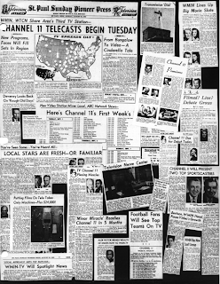
Within shot 19 of my storyboard I stated that I would contain news clips, news introductions and newspaper clippings of murders and massacres etc . This indicates a changing point within the protagonists life.
Below are some of the examples I would like to use:


Storyboard (1)

Shot 1: Introduction- Paramount pictures logo.


Shot 2: Introduction- in assocation with...TRT productions.


Shot 3: Shot of protagonist walking, leg shot only.


Shot 4: Continuation of leg shot, screen shakes emphasising the character getting shoved by the bullies and books fall to the floor.


Shot 5: Protagonist bends down to pick the books up that he dropped and is pushed back down onto the floor again. Leg shot/ full body shot.


Shot 6: Close up of the books, in which one is open then a tear drop falls into one of the books pages.


Shot 7: Protagonist walks into the school toliets, the shot is mostly composed of the door.


Shot 8: Audience see the protagonist shutting himself in cubcile


Shot 9: extreme close up of the protagonist crying.


Shot 10: (Flashback) Mid close up of the bullies laughing at the protagonist/victim this could also be considered as a p.o.v shot. Within this shot i will highlight one character as the "ring leader"! as this will be his main victim later in the film.


Shot 11: (Flashback) A point of view shot/ long shot of the protagonist sitting down at a table for lunch there will then be a track/pan movement with the camera via the tripod, and then the protagonist also the victim within this scene will get a cup of water threw over him. The reason why this could be considered a p.o.v shot yet again is that it could be taken from the point of view of the person that threw the water.


Shot 12: (Flashback) Protagonist walks into his bedroom at home, sits down and breaks down due to events that have happened recently.


Shot 13: (Flashback)Long shot. Whilst sitting down the main characters bedroom door bursts open to find his siblings.


Shot 14: (Flashback) The sibling raises his hand .


Shot 15: (Flashback) A close up of the protagonists face scared!


Shot 16: Title slide.


Shot 17: (Flashback) Shadow of the siblings hand on the wall wall.The sibling goes to hit the protagonist, but you can only see it in shadows meaning that you only see the silhouette of the protaognists face and the antagonists hand.


Shot 18: Title slide.


Shot 19: Flashing images of news reports, news theme introductions and newspapers clippings. At the end of this shot a flashed up image of the protagonists face will then flashup as he has become a deluded character.


Shot 20: Mid close up: The bullies follower will be washing her hands in a sink and then looks in the mirror, suddently the protagonist is behind her with a knife, she then screams and quickly stops when stabbed.


Shot 21: Close up of the victims face dying- (might include the close up of the pupil dilating.)


Shot 22: Title slide.


Shot 23: Full body shot of the protagonist in a red telephone box taunting his last victim (main bully) in this shot he has matured more and you never get to see his face.


Shot 24: Close up of the main bully's phone ringing, the girl is in the background out of focus when walking up to the phone to answer it her figure becomes more clearer.


Shot 25: Mid close up, the girl answers her phone and then he taunts her and hangs up.


The following shots will be displayed very quickly so they will be subliminally, so they are observed but not watched. There will also be a change in the music.

Shot 26: extreme close up of a door handle turning slowly= creating suspense.

Shot 27: Establishing/long shot, of the protagonist walking up to the victims (the bully's) house, the ex bully can be seen from the window, if the shot is looked in great detail.

Shot 28:  Girl (the main bully) is in her room and quickly packing her bags attempting to run away.

Shot 29: Protagonist approaches the girls front door, this can be seen through the frosted glass.

Shot 30: Mid close up and long shot. The girl has finished packing her bag opens her door in a hurry desperate to get away.

Shot 31:  The protagonist now the murderer, is in the doorway, he grabs her phone and turns it off.

Shot 32: Title slide. including review

Shot 33: Name of film.

Shot 34: A scream and a bloody knife drops onto the floor in slow motion.


Ideas for Theatrical Poster.

After looking at a large number of theatrical posters, I have had a number of ideas in regards to the design and composition of my poster.

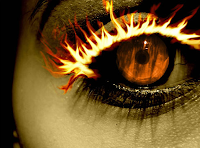
After browsing on images i came across this one, which has been taken from a movie. I like the way that the viewer is drawn straight in to the eyelashes, which have been edited to appear in firey texture. The colours enhance the tension and severity of this poster and accompany the fire well, by using black around the eyes, it makes it stand out more in comparision to the paleness of the face. By having the orange eye it contrasts well with the firey eye lashes, the orange in the eye is of a low saturation but still bright at the same time. The pupil intrestingly has been designed so that what ever angle the shot is looked from apon it appears that the character in it, is directly staring at you, adding a more personal touch. Also the pupil is not dilated due to light conditions within this scene. If i were to use this image witin my poster firstly i would change the colour scheme into something more dark and sinster, then use the selective colouring tool on photosop and would only have the eyelashes on fire, plus i would also contain a shot from the film and position it within the eye around the pupil. By having the majority of the picture in black and white it would make things appear more dramatic and by only having one aspect of it in colour would also make it stand out.
This is another shot that i found on the internet. I like the way that a scene has been positioned in the eye itself and the pupil acting as the sun, in a negative tone. Although the one think that i didn't like about the picture was the fact that it was all in black and white and If i personally was walking past i wouldn't look at it twice, also the skin appears to be in bad condition, the main focus point of this image is purley the scene within the eye, which i do not think is enough to draw in potential consumers.


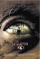
The thrid image itself is a theatrical trailer, from the film skelton key. The picture itself is not very attractive the eyebrow is composed rough, whiskery grey hair, and the skin is rough and withered, this makes the viewer want to now who this eye belongs to and gives us an impression of the characters appearence, the scene within the eye contains an archaic house and a character in a wheelchair, when looking at this I wondered if the man in the wheelchair was the same man in which his eye has been used for the poster. The huge wilow tree over the house give the viewer a rough idea of the loaction of the film. If i were to use it i would keep most things the same as I think they work really well, however the scene within the eye i would enlarge as i would like it to be either an establishing shot or an extreme close up. Also worth mentioning is the monterary symbol which is in the title, which gives a hint of the storyline.

Monday 12 October 2009

No country for old men- Teaser trailers.
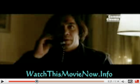

This trailer lasts 1:14 minutes and in the space of that time the
viewer is presented with a very basic but interesting story-line,
by analysing this trailer
I can find the techniques that have been used, to create such
effects in compacted time. I will analyse the shots that I have
selected, that I find interesting and think work well, and then
at the end provide a summary and mention other important
aspects within the trailer such as mis-en scene,
lighting, editing and camera techniques.

When watching this teaser trailer, i noticed that the audience
is first shown the distribution companies these being:


By having these positioned in such a way the viewer is able
to firstly associate the conglomerate companies behind the
film, but also familiating them with the company making
reference to films they have already produced.
For example when looking at MIRAMAX film I remember
the Scary Movie film, in which the MIRAMAX logo also appeared in.

Due to the storyboard not being that strong in teaser trailers
in comparison to theatrical trailers, it seems that more title transition
slides are used in order to reinforce the theme/plot of the story.
Below is a title transition taken from the station, two different colours
are used each creating a different effect, the back creates a
rather dark atmosphere as most negative things as i have stated
before are associated with the darkness, such as muggings
and murders, by having the black fading into red is
another effect used, red is normally associated with blood,
which emphases the genre of the film.


This is the first shot of what could be considered the protagonist,as his is the main character within the film although
he is the "baddy" In most horror/psychological thrillers such as this you normally would not be able to identify the murderer.

By having the shot in bad lighting conditions, it creates a scary effect with for example the large bags under the characters eyes shows
that he obviously hasn't had much sleep..is he on the hunt? mid close up enables the viewer to relate to the character and become
started by his appearance but also at the same time view his location and the props within his background.


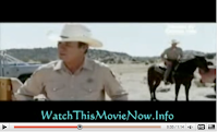
i deiceded to analyse this shot as i liked the way it was incorporated into the film, when tommy lee jones is talking
to the other character (which is in the background) the viewer is able to see both of them at the same time, but in different
ways tommy lee jones being in a mid close up, where the viewer is wearing a police uniform, displaying his authority within the film
and the other character on a horse also in a uniform, by having the two different shots it portrays two different effects
the mid close up enables us to see his emotions whereas the long shot enables the viewer to see the lifestyle within the location
and the background etc.


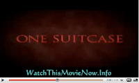
This title slide also made an impact on me. When watching it when this appeared i was like ...A suitcase....how can that be of any importance...whats in it? etc etc by having an ordinary object such as this within the story-line it really makes the audience wonder what makes it so special.


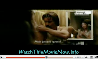
This shot is also like the one of the two characters communicating that i have also screen snapped, instead of communicating in the background he is talking into the mirror where his wifes reflection is, by doing this the producer has created it two mid close ups at once through the aid of a prop. i really liked the way this shot worked and decided to input this in my


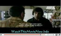
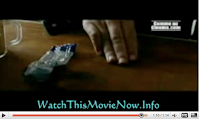
The last two shots that i decided to deconstruct are displayed shortly after each other. I liked the over the shoulder shot as you can still see both characters and hope to include one of these in my own teaser trailer, as i have realised that this type of shot is increasingly used within horror films as it makes the audience become more involved in the murder as we feel like we are standing behind the victim. The other shot is a close up of the protagonist's hand, as he has a coin in it, within this scene the progatonist goes on about a coin film meaning so much, i like the way the "Coen brothers" have created such suspense and drama around a mere coin and a coin toss, in which it will tell the characters fate whether he lives of dies.

*SOUND*
The music from the teaser trailer is mostly non diagetic, such as the banjo playing which alone is normally associated with the countryside of America, plus the narration of the story at the beginning. Plus the characters accents give the location away as well. Although some diagetic sound is used for example, the phone ringing, and the coin toss.

*MIS EN SCENE* and *PROPS*
The trailer seems to contain large amounts of pick up trucks, horses, sheriff uniforms, tartan styled shirts, the grimy bathroom, the stash of drugs on the back of the vehicle and the use of pay phones.
All of these props contained within the scenes enhance the ideologies behind it, being the country life style, the hierarchy of life in that area i.e. the sheriff's ruling it etc.

*EDITING*
-The title transition slides that have been used in order to get the story line across in a shortest time as possible. Most transitions used within this piece are zooms ,fades or just simply blackouts, by doing this the director is able to get in as many shots as possible, narrating the story line etc as not much footage is used, the trailer mostly consists of multiple shots.

*TIMING*
This teaser trailer contains approximately; 26 shots mean that on average 1 shot every 2 seconds. after analysing other teaser trailers i can then calculate an overall average of how many shots i will need to have per second in order for mine to be professional.