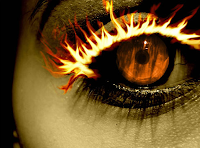
After browsing on images i came across this one, which has been taken from a movie. I like the way that the viewer is drawn straight in to the eyelashes, which have been edited to appear in firey texture. The colours enhance the tension and severity of this poster and accompany the fire well, by using black around the eyes, it makes it stand out more in comparision to the paleness of the face. By having the orange eye it contrasts well with the firey eye lashes, the orange in the eye is of a low saturation but still bright at the same time. The pupil intrestingly has been designed so that what ever angle the shot is looked from apon it appears that the character in it, is directly staring at you, adding a more personal touch. Also the pupil is not dilated due to light conditions within this scene. If i were to use this image witin my poster firstly i would change the colour scheme into something more dark and sinster, then use the selective colouring tool on photosop and would only have the eyelashes on fire, plus i would also contain a shot from the film and position it within the eye around the pupil. By having the majority of the picture in black and white it would make things appear more dramatic and by only having one aspect of it in colour would also make it stand out.

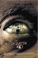
The thrid image itself is a theatrical trailer, from the film skelton key. The picture itself is not very attractive the eyebrow is composed rough, whiskery grey hair, and the skin is rough and withered, this makes the viewer want to now who this eye belongs to and gives us an impression of the characters appearence, the scene within the eye contains an archaic house and a character in a wheelchair, when looking at this I wondered if the man in the wheelchair was the same man in which his eye has been used for the poster. The huge wilow tree over the house give the viewer a rough idea of the loaction of the film. If i were to use it i would keep most things the same as I think they work really well, however the scene within the eye i would enlarge as i would like it to be either an establishing shot or an extreme close up. Also worth mentioning is the monterary symbol which is in the title, which gives a hint of the storyline.

No comments:
Post a Comment